

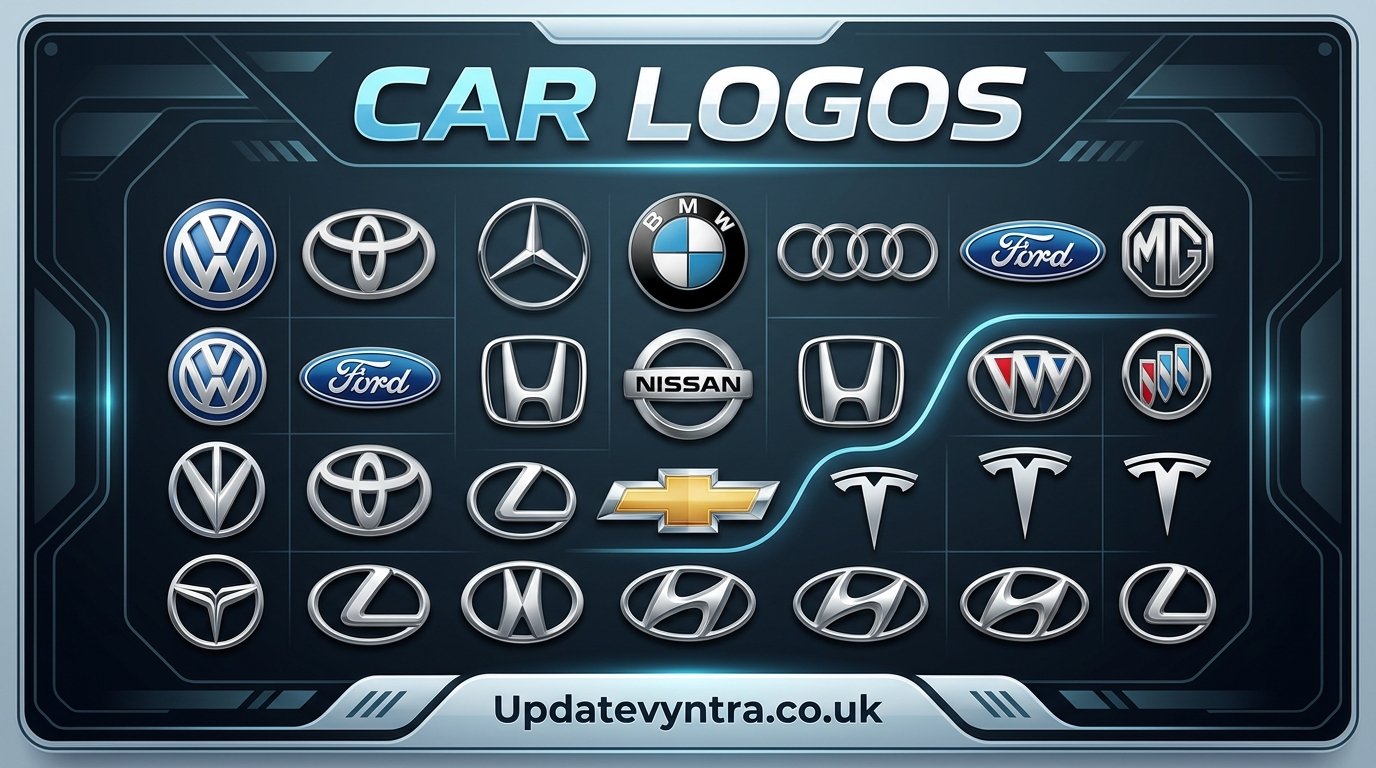
Car logos are more than simple pictures placed on the front of a vehicle. They are visual identities that help people recognize a brand within seconds. Whether it is a three-pointed star, a charging bull, a blue-and-white roundel, or a four-ring emblem, a car logo can communicate ideas about performance, luxury, reliability, history, and innovation.
For many drivers and car enthusiasts, recognizing car logos is almost like recognizing famous faces. Some symbols are instantly familiar, while others require a closer look. Over the years, automobile manufacturers have carefully developed their logos to reflect their changing identities and connect with customers around the world.
The fascinating thing about car logos is that many of them have meaningful stories behind their shapes, colors, letters, and symbols. Some were inspired by a company’s founders, while others represent a location, an important historical event, or the original purpose of the company. Even small changes to a logo can mark a major new chapter in an automaker’s history.
Why Car Logos Matter to Automobile Brands
A strong logo gives an automobile company an identity that people can remember. Cars are often seen from a distance, so a distinctive emblem can immediately tell someone which manufacturer produced the vehicle. This is particularly important when many vehicles share similar body shapes, colors, and design features.
Car logos also create an emotional connection between a driver and a brand. A luxury badge may suggest elegance and prestige, while a performance-focused emblem can create an impression of speed and excitement. Even when people have never owned a particular vehicle, they may already have an opinion about its brand because of its reputation and recognizable symbol.
Modern car manufacturers understand that their logos need to work across many different platforms. A badge must look attractive on a vehicle grille, but it should also work on websites, mobile applications, advertisements, steering wheels, clothing, and digital displays. This is one reason many automotive companies have simplified their logos in recent years.
The move toward electric vehicles has also influenced automotive branding. As manufacturers introduce new electric models and technologies, some have redesigned their traditional emblems with cleaner and more minimal designs. These changes are intended to make established brands feel modern while preserving enough of their original identity to remain recognizable.
Famous Car Logos and the Stories Behind Them
Among the world’s most recognizable car logos is the Mercedes-Benz three-pointed star. The symbol is associated with the company’s ambition to build engines suitable for use on land, water, and in the air. Over time, the star became closely connected with luxury automobiles and engineering excellence.
BMW’s famous roundel is another emblem that attracts plenty of attention. The blue and white colors are strongly associated with Bavaria, the German region where the company originated. The logo is often incorrectly described as a representation of a spinning airplane propeller, although its historical development is more closely connected to the company’s Bavarian roots and earlier branding.
The Audi emblem is made up of four interconnected rings. The rings represent the four companies that formed Auto Union in the 1930s. Today, the simple design has become one of the most recognizable symbols in the automotive world. Its clean appearance also fits naturally with Audi’s modern approach to vehicle design.
Ferrari’s prancing horse is perhaps one of the most famous performance-car symbols ever created. The black horse was associated with Italian aviator Francesco Baracca and later became connected with Ferrari through a story involving Baracca’s family and Enzo Ferrari. The yellow background represents Modena, Ferrari’s hometown. Together, the elements create a badge strongly associated with Italian motorsport and high-performance automobiles.
Lamborghini uses a charging bull, a symbol chosen by founder Ferruccio Lamborghini. His interest in bulls and bullfighting influenced the company’s branding. Several Lamborghini models have also received names connected to famous fighting bulls, making the bull emblem an important part of the company’s identity.
Another highly recognizable symbol belongs to Porsche. Its crest incorporates elements associated with Stuttgart and the German state of Württemberg-Hohenzollern, along with a horse representing Stuttgart. The result is a detailed emblem that combines regional heritage with Porsche’s performance-oriented identity.
Ford has taken a different approach with its familiar blue oval. The design is simple and highly recognizable, allowing the company name to remain the central feature. Since Ford has been one of the world’s most influential automobile manufacturers, its oval emblem has become strongly associated with everyday transportation, trucks, and American automotive history.
Toyota’s logo is also instantly recognizable. Its three overlapping oval shapes were introduced in 1989 and are commonly interpreted as representing relationships between the company and its customers, as well as the future possibilities of the brand. The design also incorporates the letters of Toyota in a subtle way.
Honda’s emblem is particularly straightforward. The capital H inside a rectangular shape has become closely associated with Honda’s reputation for practical engineering and dependable vehicles. Honda also uses a separate stylized wing emblem for some of its motorcycle branding, showing how one company can develop different visual identities for different parts of its business.
How Car Logos Have Changed Over Time
Car logos have not remained unchanged. Many manufacturers have modified their emblems as their businesses and customers have evolved. Older badges were sometimes highly detailed, featuring complex illustrations, shields, crowns, animals, or decorative elements. Modern designs tend to use fewer details and cleaner shapes.
One reason for this change is the rise of digital media. A detailed emblem that looks impressive as a metal badge may become difficult to recognize when displayed as a tiny icon on a smartphone. A simpler logo can remain clear at many different sizes, from a vehicle’s steering wheel to a small application icon.
Three-dimensional badges have also increasingly been represented through flatter designs. Instead of relying heavily on shadows, reflections, and metallic effects, modern branding often uses simple lines and carefully selected typography. This approach gives a company more flexibility across digital platforms.
However, changing a famous logo can be risky. Customers often develop strong emotional connections with familiar symbols. If a redesign removes too much of the original character, people may feel that the brand has lost part of its identity. For this reason, successful automotive logo updates usually preserve important elements while making the overall appearance cleaner.
Electric vehicle manufacturers are adding another dimension to this evolution. New companies often use minimalist symbols designed specifically for a digital-first world, while established automakers must balance tradition with modern technology. The result is a fascinating mix of old automotive heritage and new visual language.
How to Recognize Car Logos More Easily
Learning car logos becomes much easier when you focus on distinctive features rather than trying to memorize every emblem at once. Start with major symbols and look at their shapes, colors, letters, and animals. For example, a horse, bull, star, or set of interlocking rings can provide an immediate clue about a vehicle’s manufacturer.
It can also help to learn logos by category. German luxury brands, Japanese manufacturers, American automakers, Italian performance companies, and newer electric-vehicle brands often have recognizable design characteristics. Understanding a little about automotive history can make the symbols even easier to remember.
Pay attention to small differences as well. Several manufacturers use circles, shields, letters, or wings, but their proportions and combinations of elements are usually different. Looking at the entire emblem rather than one isolated feature can prevent confusion between similar brands.
Car logos are especially interesting because they combine design and history. Once you learn why a particular symbol exists, it becomes much easier to remember. Instead of seeing a random shape, you begin to see a story connected to a company, its founders, its country, and its ambitions.
The Future of Car Logos
The future of car logos will likely be shaped by digital technology, electric mobility, and changing consumer expectations. Vehicle displays are becoming more advanced, and manufacturers have more opportunities to use animated or illuminated versions of their traditional symbols.
At the same time, classic badges are unlikely to disappear. Automotive brands have spent decades building recognition around their visual identities. Even when a company introduces a new electric platform or redesigns its vehicles, maintaining a connection with its history can provide valuable continuity.
Some future logos may become even simpler, while others could use lighting and digital interfaces to create a more dynamic experience. The challenge for manufacturers will be finding the right balance between innovation and familiarity.
Conclusion
Car logos are small symbols with surprisingly big stories. They can represent national heritage, engineering ambition, motorsport success, family history, regional identity, or a company’s vision for the future. From luxury manufacturers to mass-market automakers and performance brands, each emblem contributes to the personality of the vehicles wearing it.
What makes car logos particularly interesting is how much meaning can be packed into a simple design. A few shapes, colors, letters, or symbols can create an identity recognized by millions of people around the world.
As the automobile industry continues to change, car logos will change with it. Yet the most successful symbols will continue to connect the past with the future. Whether displayed on a classic sports car, a family vehicle, or a modern electric model, a great logo remains one of the most powerful ways for a car brand to tell its story.
